Here’s what nobody tells you about styling a console table: the difference between “beautifully styled” and “chaotic mess” is about three items. Seriously. I learned this the hard way after spending weeks collecting the perfect objects for my entryway console, arranging them carefully, stepping back and… it looked like a yard sale explosion.
Too many vases. Too many books. Too many “meaningful objects.” Too much everything.
Then I saw a friend’s console table that stopped me in my tracks. It had maybe five things on it total. Five. And it looked like it belonged in a magazine. That’s when I understood that console table decorating modern style is about restraint, not abundance.
If your console table looks cluttered, overwhelming, or just… off, these decor console table strategies will show you how to create that perfectly curated look without overthinking it. Because the goal is “effortlessly styled,” not “I spent six hours moving objects around.”
Understanding Console Table Styling
Before we start buying decorative objects, let’s talk about what makes console in living room or entryway styling actually work.
The Purpose of Console Tables
Functional needs:
- Drop zone for keys, mail, phone
- Storage for everyday essentials
- Surface for lighting
- Display space for decor
Visual needs:
- Create focal point in room
- Add personality and style
- Provide horizontal surface in vertical space
- Ground wall art or mirror above
The balance: Your console needs to be both beautiful AND functional. All style, no function = frustrating. All function, no style = boring.
The Golden Styling Rules
Rule 1: Less is more
- 3-7 items maximum
- If in doubt, remove something
Rule 2: Vary heights
- Tall, medium, short objects
- Creates visual interest
- Prevents flat, boring look
Rule 3: Group in odd numbers
- 1, 3, 5 items look more natural
- Even numbers feel formal/static
Rule 4: Leave breathing room
- Negative space is crucial
- Don’t cover every inch
- The inspo console is maybe 40% covered
Rule 5: Create purpose
- Books for reading
- Bowl for keys
- Objects should make sense
- Not just random pretty things
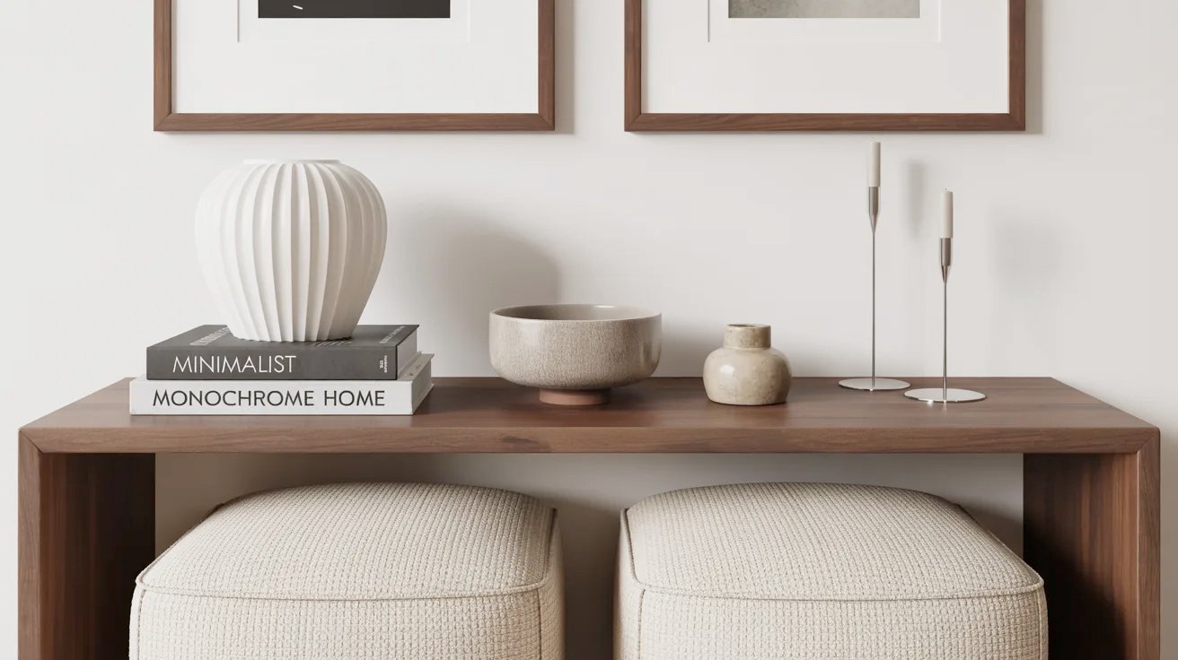
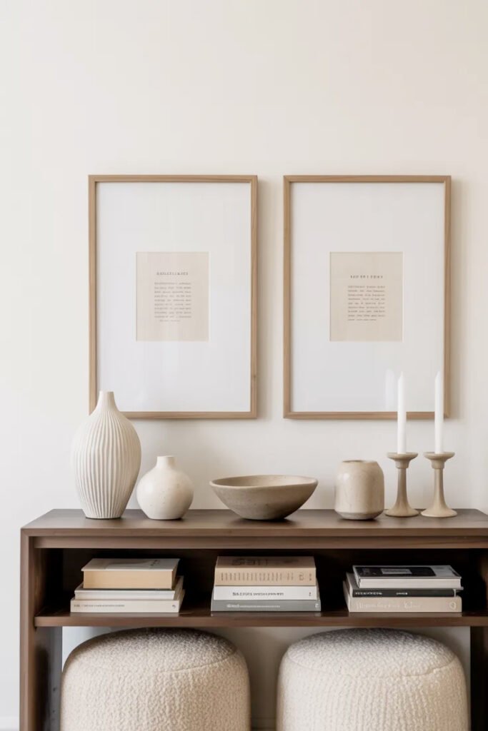
The inspiration image follows these rules perfectly: limited items, varied heights, plenty of empty space, and everything looks intentional.
The Layered Styling Formula
The console in the inspiration image uses a specific formula. Let me break it down so you can replicate it.
The Foundation Layer: Books
Stack of 2-3 books (like the inspo):
Why it works:
- Adds height and substance
- Creates platform for objects
- Shows personality (book titles matter)
- Provides visual weight at base
Choosing books:
- Hardcover coffee table books
- Neutral or complementary spines
- Titles you’d actually read (authenticity matters)
- Similar sizes for cleaner stack
Titles in the inspo:
- “Minimalist” (perfect for the aesthetic)
- “Monochrome home”
- “If Travel Home” or similar
- All on-brand for the look
Placement:
- Slightly off-center or to one side
- Not dead center (feels too symmetrical)
- Horizontal stacks (not vertical)
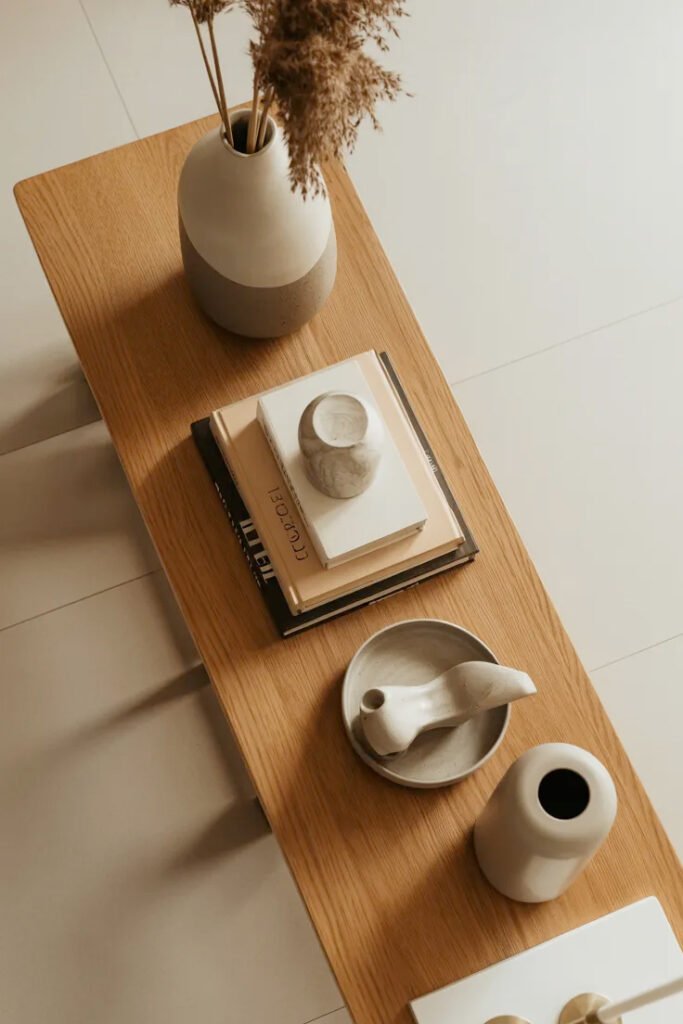
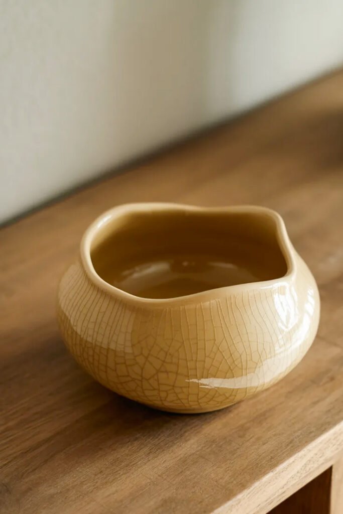
The Sculptural Element: Statement Vase
Large decorative vase (like the white fluted vase in inspo):
Why it works:
- Adds vertical height
- Creates organic/curved shape
- Provides textural interest
- Doesn’t require flowers (can stand alone)
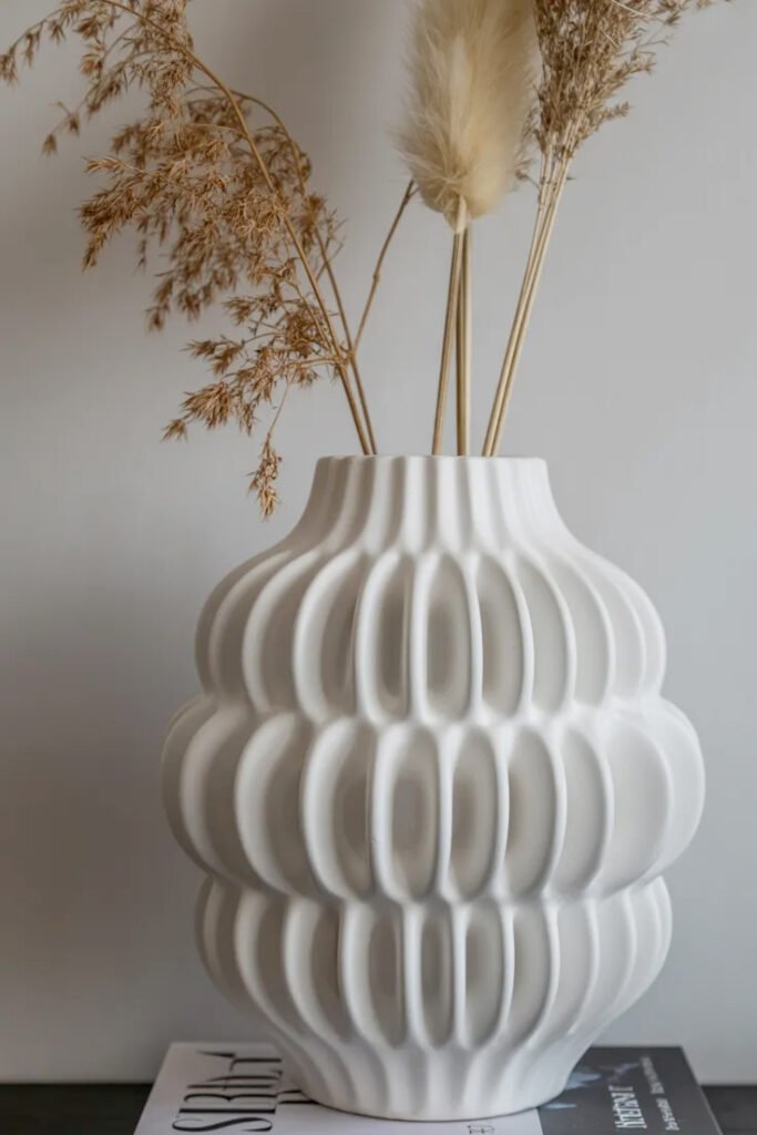
Best vase characteristics:
- Sculptural shape (not just plain cylinder)
- Neutral color (white, cream, natural)
- Interesting texture (fluted, ridged, organic)
- Substantial size (12-18 inches tall)
The inspo vase:
- White ceramic with fluted/wavy texture
- Modern organic shape
- Sits on book stack (adds more height)
- Empty (no fuss, no maintenance)
Placement:
- On book stack for elevation
- To one side (not center)
- Allows room for other objects
The Natural Element: Organic Objects
Bowl, pot, or natural item:
The inspo has:
- Textured neutral bowl
- Small pottery vessel
- Natural wood or stone element
Why natural elements work:
- Add warmth to modern pieces
- Provide textural contrast
- Ground the styling
- Bring organic element indoors
Options:
- Wooden bowl or tray
- Stone or ceramic vessel
- Dried botanicals
- Natural fiber basket
What to avoid:
- Bright colors
- Plastic or synthetic materials
- Too many plants (one max)
- Fussy arrangements
The Vertical Accents: Candles or Height
Candlesticks (like the inspo):
Why they work:
- Add height variation
- Create vertical lines
- Provide symmetry option
- Can be functional (actual candles)
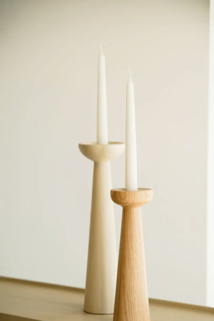
The inspo has:
- Two neutral candlesticks
- Similar but not identical heights
- Simple, sculptural shapes
- Warm neutral tones
Alternatives:
- Single tall vase
- Small sculpture
- Decorative object with height
- Table lamp
Choosing Your Console Table
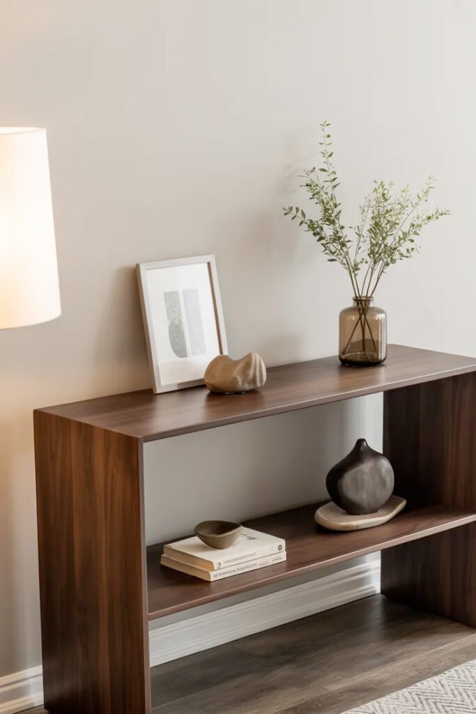
The dark wood console in the inspiration image is the perfect foundation. Let’s talk about selecting yours.
Console Table Styles
Modern minimalist (like inspo):
- Clean lines
- Dark wood (walnut, espresso)
- No ornate details
- Simple geometric shape
- Slim profile
Traditional:
- More decorative
- Curved legs
- Lighter wood or painted
- More ornate
Industrial:
- Metal and wood combination
- Raw, edgy
- Exposed hardware
- Modern warehouse vibe
Mid-century modern:
- Tapered legs
- Warm wood tones
- Retro silhouette
- 1950s-60s inspired
The walnut home decor aesthetic in the inspo is perfect for modern spaces—rich, warm, and sophisticated.
Size Considerations
Width:
- 42-60 inches typical for entryways
- Can be wider in living rooms
- Should fit wall space proportionally
- The inspo appears about 48 inches
Depth:
- 12-18 inches for entryways
- Can be deeper (20+ inches) in living rooms
- Slim profile essential for traffic flow
- The inspo looks about 14 inches
Height:
- 28-32 inches standard
- Should align with bottom of wall art/mirror
- Comfortable for styling and using
Open vs. closed storage:
- Open (like inspo): Cleaner look, more modern
- Drawers/cabinets: Hide clutter, more function
- Shelf below: Extra storage/display (like inspo)
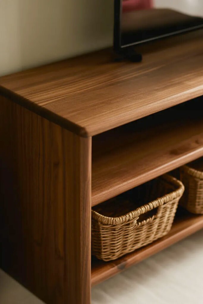
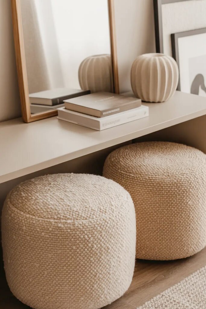
The inspiration console has an open shelf below—perfect for tucking two poufs or baskets underneath.
Material and Finish
Wood (like inspo):
- Walnut, oak, or espresso
- Rich, warm, classic
- Works in most spaces
- Walnut: Deep brown, luxurious
- Oak: Lighter, more casual
- Espresso: Dark, dramatic
Metal:
- Black, brass, or chrome
- More industrial or modern
- Can feel cold without wood elements
Glass:
- Lightest visual weight
- Makes small spaces feel larger
- Less warm than wood
Painted wood:
- White, black, or color
- More casual or traditional
- Versatile for changing decor
The dark walnut console in the inspo provides the perfect neutral, sophisticated base for lighter decor.
Wall Art Above Console
Those two matching framed prints above the console in the inspiration image complete the whole look. This is critical home decor hallway strategy.
The Two-Frame Approach
Why two matching frames work (like inspo):
Creates symmetry: Balanced and intentional.
Fills horizontal space: Console tables are wide; one frame can look lonely.
Allows variety: Two different images with cohesive framing.
Feels collected: More interesting than one large piece.
Easy to source: Matching frames from same store.
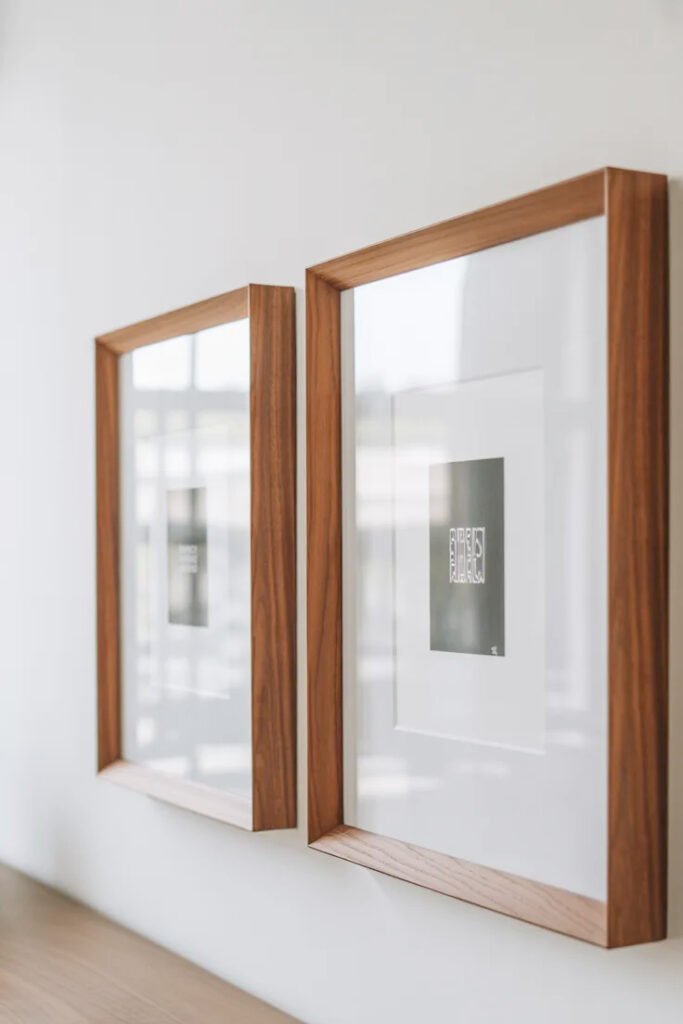
Frame Selection
The inspo frames:
- Thin wood frames (appears walnut or brown)
- Square format (looks like 20×20 or 24×24)
- Wide white mats
- Simple, clean profile
- Matches console wood tone
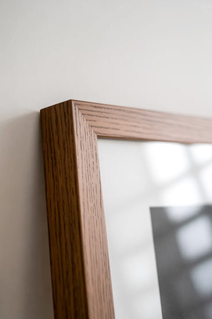
Why this works:
- Wood frames coordinate with wood console
- White mats brighten and create breathing room
- Simple frames don’t compete with art
- Large mats make any image look more gallery-like
Alternative frame options:
- Thin black metal (modern)
- Natural light wood (casual)
- Brass or gold (traditional, glamorous)
- Mix of two styles (eclectic)
Art Selection
For cohesive look:
- Similar subject matter or style
- Both color or both black and white
- Same size frames and mats
- The inspo appears to have neutral/minimal images
Best subjects for console styling:
- Abstract minimalist prints
- Black and white photography
- Botanical or nature prints
- Architectural images
- Simple line drawings

What to avoid:
- Busy, colorful, competing images
- Vastly different subjects
- Mismatched frame sizes
- Too personal (family photos work elsewhere)
Hanging Height and Spacing
Height:
- Center of frames at 57-60 inches (eye level)
- Or 4-8 inches above console top
- Should feel connected to console below
Spacing:
- 2-6 inches between frames
- Closer = more cohesive
- Farther = more breathing room
- The inspo has about 4 inches
Alignment:
- Centered over console as a pair
- Bottom edges aligned (not tops)
- Symmetrical placement
I hung my two frames with 4 inches between them, centered over my console. Used a laser level and painter’s tape to map it first—totally worth the extra 10 minutes.
Color Palette Strategy
The neutral, monochromatic palette in the inspiration image is console table decorating modern perfection.
The Neutral Base
Colors in the inspo:
- White (vase, mats, wall)
- Cream/beige (poufs, bowl, books)
- Brown (console, frames, pottery)
- Natural textures throughout
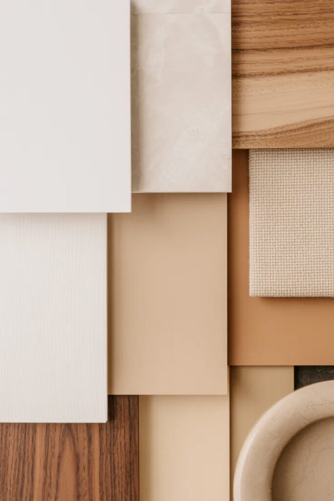
Why this works:
- Cohesive and calm
- Lets shapes and textures shine
- Timeless, not trendy
- Easy to maintain
- Works with any decor
Adding Subtle Variation
Texture over color:
- Smooth ceramic vs. rough pottery
- Matte vs. slightly glossy
- Wood grain vs. woven fabric
- Different whites and creams
Tonal neutrals:
- Warm whites to warm browns
- All in same temperature family
- Creates depth without color
Strategic accent (optional):
- ONE item in muted color
- Dusty blue, sage, terracotta
- Very subtle, not bold
- The inspo skips this (all neutral)
What Kills the Look
Too many colors: More than 3-4 colors = chaos.
Bright pops: Neon or primary colors feel jarring in modern neutral styling.
Too matchy: Everything the exact same beige = flat.
Wrong undertones: Cool and warm neutrals mixed = muddy.
The Pouf Addition
Those two textured poufs under the console in the inspiration image are genius. Let’s talk about this styling move.
Why Poufs Under Console Work
Functional:
- Extra seating when needed
- Pull out for guests
- Putting on shoes
- Step stool for kids
Visual:
- Fills empty space under console
- Adds another layer of texture
- Creates cozy, lived-in feel
- Anchors the console visually
The inspo poufs:
- Textured bouclé or similar fabric
- Cream or natural color
- Rounded dome shape
- Tuck neatly under console shelf
Pouf Selection
Size:
- 16-20 inches diameter
- Low enough to fit under console
- Two fit side-by-side under most consoles
Material:
- Bouclé (very trendy, textured)
- Woven natural fiber
- Wool or cotton
- Leather (more masculine)
Color:
- Neutrals (cream, beige, natural)
- Match your palette
- Don’t introduce new color here
Shape:
- Round (most common, like inspo)
- Square
- Organic/irregular
Alternatives to Poufs
Baskets:
- Woven natural baskets
- More rustic/casual
- Can store items inside
Ottoman:
- Small upholstered ottoman
- More traditional
Nothing:
- Leave it empty
- Cleaner look
- Less cozy
The poufs in the inspo add warmth and function without cluttering—perfect balance.
Styling for Different Locations
Entryway console (like inspo):
Priority: Function + first impression
Must-haves:
- Catchall for keys
- Maybe a lamp
- Mirror or art above
- Minimal clutter
Living room console:
Priority: Decorative display
Can include:
- More decorative objects
- Books you’re reading
- TV remote catchall
- More flexibility
Behind sofa:
Priority: Visual from both sides
Considerations:
- Looks good from behind
- Lower items (don’t block view)
- More symmetrical styling
Hallway console:
Priority: Narrow, functional
Must-haves:
- Very slim (12 inches max)
- Minimal styling
- Wall-mounted often better
Common Console Styling Mistakes
Mistake #1: Too Many Small Objects
Lots of tiny items create visual clutter. Stick to fewer, larger pieces.
Mistake #2: Everything the Same Height
All flat items = boring. Vary heights with stacks, tall vases, candles.
Mistake #3: Covering Every Inch
Negative space is part of the design. Leave 40-60% empty.
Mistake #4: No Connection to Wall Art
Console styling should relate to what’s above it—coordinate don’t compete.
Mistake #5: Seasonal Decor Overload
A little seasonal is fine; full-on Halloween explosion in October = tacky.
Mistake #6: Neglecting Function
If you need it to hold keys/mail but styled it to death = daily frustration.
Mistake #7: Mismatched Styles
Modern console + shabby chic decor + traditional frames = confused.
Budget Breakdown: Style a Console ($300)
Console table (if needed): $200-400
- Or use existing
Two frames + mats + prints: $100
- IKEA, Target, or print your own
Decorative vase: $40
- HomeGoods, Target, West Elm sale
Books (used): $20
- Already own or thrift stores
Bowl/pottery: $25
- Thrift, HomeGoods, Amazon
Candlesticks: $30
- Pair from Target or IKEA
Two poufs (optional): $80-150
- Amazon, Target, Article
Total for styling alone: ~$245 (without console)
With console: ~$445-645 total
You can do it for less:
- Shop your home first
- Thrift the decorative pieces
- DIY artwork (print and frame)
- Skip the poufs initially
I styled my console for under $150 by using books I already owned, one statement vase from HomeGoods ($35), a thrifted bowl ($8), and frames from IKEA with my own printed art ($60 total).
Maintaining Your Styled Console
Daily:
- Put keys in designated spot
- Don’t pile mail (deal with it)
- Wipe down if dusty
Weekly:
- Dust objects and console
- Straighten books
- Remove any clutter accumulation
Monthly:
- Deep clean
- Assess if styling still works
- Rotate one element if feeling stale
Seasonally:
- Maybe swap one object
- Change artwork if desired
- Don’t overhaul constantly
The goal is making it look effortless, which means it should BE mostly effortless to maintain.
Adapting the Look
For traditional homes:
- More ornate console
- Warmer wood tones
- Classic candlesticks
- Traditional frame styles
For modern homes (like inspo):
- Clean-lined console
- Minimal objects
- Simple frames
- Neutral palette
For eclectic homes:
- Mix of styles
- More color okay
- Varied objects
- Collected feel
For small spaces:
- Slimmer console (12 inches deep)
- Fewer objects (3-5 total)
- Wall-mounted option
- Keep it minimal
Quick Refresh Ideas
When it feels stale:
Easy swaps:
- Change one vase for another
- Swap artwork
- New books
- Different candles
Seasonal touches (subtle):
- Small pumpkin in fall
- Fresh evergreen in winter
- Flowers in spring
- Lighter colors in summer
Don’t change:
- The console (obviously)
- The basic formula
- The entire styling
Final Thoughts: Less Really Is More
Console table styling is one of those design challenges where restraint creates the most impact. The inspiration image proves it: a handful of carefully chosen objects in a cohesive neutral palette looks infinitely better than a surface crowded with “meaningful items.”
Start with the formula: books as foundation, statement vase for height, natural elements for texture, vertical accents for variety. Keep your color palette neutral and cohesive. Leave plenty of breathing room. Connect your styling to the art above.
The whole look should feel effortless and intentional, not overthought or precious. You should be able to use your console for its actual purpose (keys, mail, phone) without disrupting the aesthetic.
My console went from “I can’t figure this out” to “this looks like I hired a stylist” once I embraced the less-is-more approach. I removed about half of what I’d had on there, switched to all-neutral colors, and suddenly it all clicked. Total investment: about $150 over time. Impact: looks like a $1,000 designer moment.
Your console table deserves to be more than a dumping ground. Give it the simple, curated styling it needs, and create a moment in your home that makes you smile every time you walk past it. 🙂