You know what’s harder than decorating a spacious entryway? Decorating a tiny one. There’s literally just a sliver of wall, maybe room for one small piece of furniture, and you’re supposed to make it welcoming, functional, AND beautiful? Yeah, right.
I lived in an apartment with an entryway that was maybe 3 feet wide and 6 feet long. Every design idea I found online seemed to require at least twice the space I had. I tried cramming in a console table (blocked the walkway), added too many hooks (looked cluttered), hung one sad piece of art (looked lonely). Nothing worked until I discovered that entryway decor small entrance design is actually about strategic minimalism, not just “regular design but smaller.”
Once I understood the principles of decorating tiny spaces, my cramped entryway went from “I hate this” to “wow, this is actually pretty charming.” And the best part? The solutions are often simpler AND cheaper than what you’d do in a larger space.
If you’re struggling with a small entryway that feels impossible to decorate, these mini hallway decor ideas will show you how to create maximum impact with minimal space.
Understanding Small Entryway Challenges
Before we start hanging art and buying furniture, let’s acknowledge what makes entryway decor small entrance spaces so tricky.
The Unique Problems
Limited wall space: Maybe 3-4 feet of usable wall, if you’re lucky.
No room for furniture: A standard console table blocks the entire walkway.
Feels cramped instantly: One wrong choice makes it feel claustrophobic.
High visibility: Everyone sees it immediately, so mistakes are obvious.
Needs to be functional: Keys, shoes, coats still need somewhere to go.
Can’t sacrifice walkability: People need to actually walk through without obstacles.
Often dark: Small entryways rarely have windows or natural light.
The Design Goals
Create visual interest: Without overwhelming the small space.
Maximize every inch: Vertically and strategically.
Keep it simple: Less is genuinely more in tiny entryways.
Maintain functionality: Beauty can’t come at the expense of usability.
Make it feel intentional: Not accidental or forgotten.
Ensure good traffic flow: Nothing blocking movement.
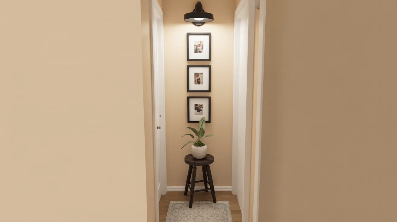
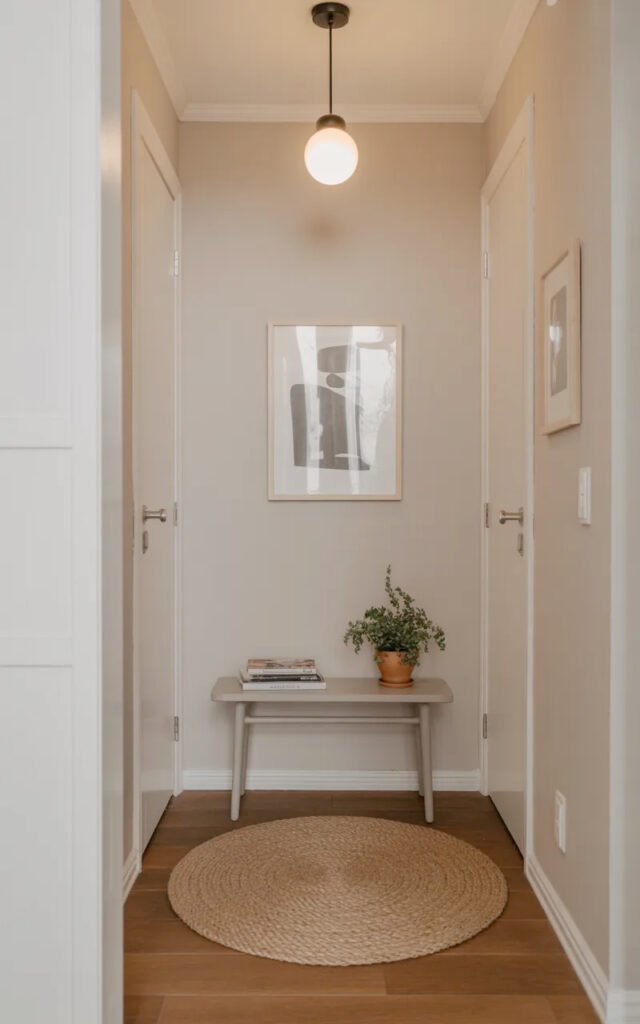
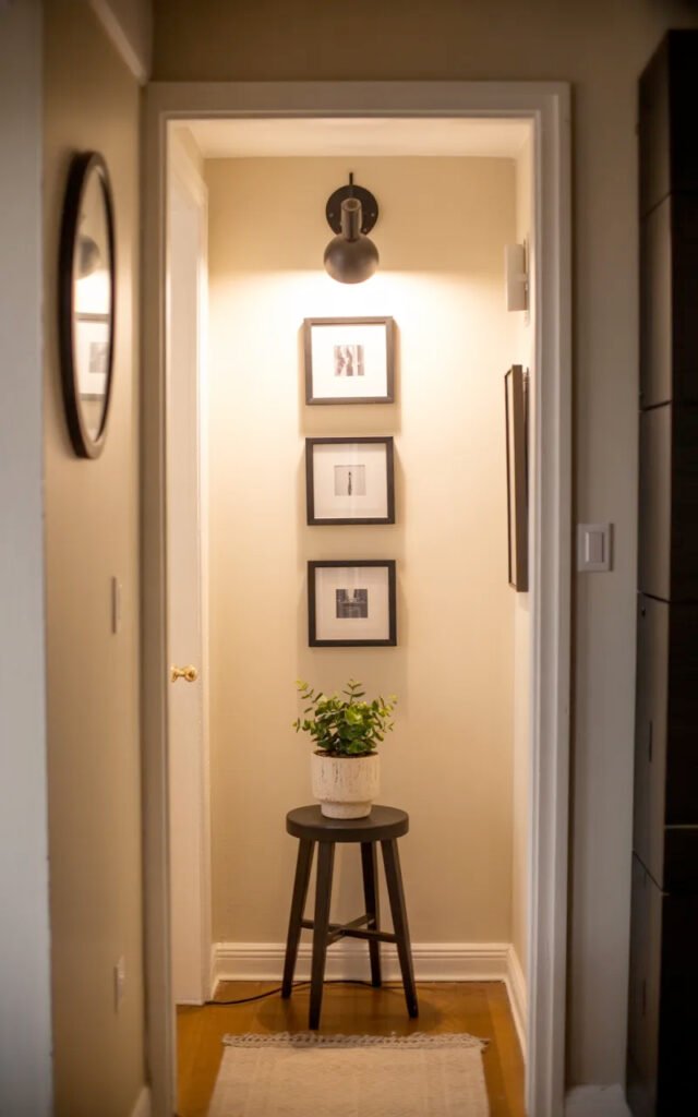
The inspiration image nails this: vertical gallery wall, one small plant stand, perfect lighting, and strategic simplicity. That’s the formula.
The Vertical Gallery Wall: Your Small Space Solution
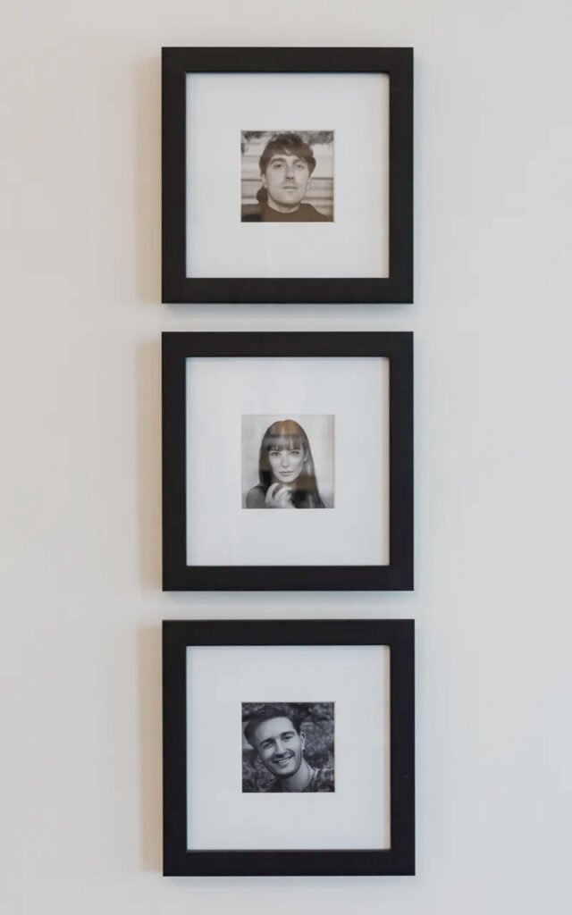
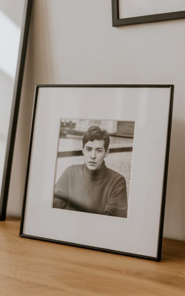
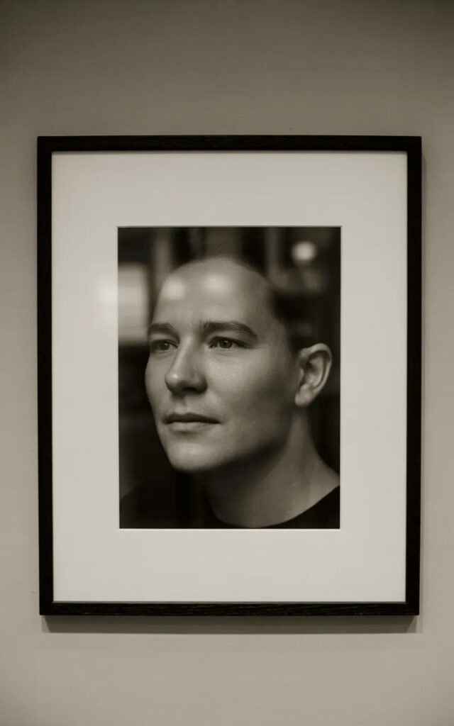
Those three stacked photos in the inspiration image? That’s the secret to picture wall entryway success in tiny spaces. Let’s break down why this works so brilliantly.
Why Vertical Gallery Walls Work in Small Entryways
Uses limited wall space efficiently: Goes up instead of out.
Creates focal point: Draws the eye upward, making ceiling feel higher.
Doesn’t require much width: Works on narrow wall sections.
Add personality: Showcase photos or art without taking floor space.
Easy to execute: Simple to plan and hang compared to complex layouts.
Budget-friendly: A few frames is all you need.
Highly customizable: Use what you already have or buy specific pieces.
The Vertical Stack Layout
What it is: Frames arranged in a vertical column (like the inspo)
Why it works:
- Emphasizes height over width
- Clean, organized look
- Easy to center on narrow wall
- Visually extends the space upward
- Simple to plan (just stack ’em)
How many frames:
- 3 frames: Looks intentional and complete (like inspo)
- 2 frames: Can work but may feel incomplete
- 4+ frames: Risk of looking too busy in tiny space
Spacing:
- 2-4 inches between frames
- Keep it consistent
- Tighter spacing (2 inches) feels more cohesive
Choosing Frames and Art
Frame style (like the inspo):
Matching frames:
- All the same color and profile
- Creates unity and calm
- Black frames (like inspo) are classic and modern
- Also consider: thin gold, natural wood, white
Size consistency:
- All the same size (like inspo) is easiest
- Or graduated sizes (largest at bottom)
- Square frames often work best (12×12, 16×16)
- The inspo looks like 16×16 or 18×18
Mat considerations:
- White or cream mats (like inspo)
- Creates breathing room around image
- Makes any photo look more polished
- Consistent mat width (2-3 inches)
Art/photo selection:
Black and white photos (like inspo):
- Cohesive and sophisticated
- Works with any decor
- Timeless
- Personal photos or art prints
Consistent subject:
- All portraits (like inspo)
- Or all landscapes
- Or all abstract
- Theme creates unity
Personal touch:
- Family photos
- Travel memories
- Meaningful moments
- Makes entryway feel like YOURS
I created a vertical gallery wall with 3 black-framed family photos (16×16 inches each) in my tiny entryway. Frames from IKEA for $15 each, photos printed at Costco for $8 each. Total: $69. Completely transformed my space from blank and boring to personal and styled.
Installation Tips for Vertical Walls
Measuring and marking:
- Measure your wall height
- Measure total height of all frames + spacing
- Center the group on the wall
- Mark each frame position with painter’s tape
- Step back and check before committing
Height placement:
- Center of middle frame at 57-60 inches (eye level)
- Or center the entire grouping at eye level
- The inspo grouping looks centered as a unit
Hanging hardware:
- Use proper picture hanging hooks
- Level each frame
- Make sure they’re secure
- Check level multiple times
Alternative: Picture ledge:
- Install one long ledge
- Layer frames on it
- Can rearrange without new holes
- More flexible
The One-Piece Furniture Rule
Notice the inspiration image has exactly ONE piece of furniture—that small plant stand. This is the golden rule of apartment entry way idea design: one small piece maximum.
Why Less Is More
Preserves walkway: Most important consideration in small spaces.
Prevents clutter: One item looks intentional; multiple items look crowded.
Easier to keep organized: Less surface area to pile stuff on.
Makes space feel larger: Open floor space = visual breathing room.
Forces you to choose wisely: Your one piece has to be perfect.
Best Single Furniture Pieces for Small Entryways
Small accent table/stool (like the inspo):
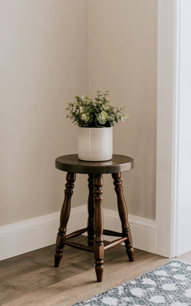
Size:
- 12-15 inches diameter or width
- Low profile (18-24 inches high)
- Minimal footprint
Uses:
- Plant display (like inspo)
- Catchall for keys
- Small decorative moment
- Doesn’t block movement
Styles:
- Three-legged stool (like inspo)
- Small drum table
- Narrow plant stand
- Vintage chair
Where to place:
- Against wall out of traffic path
- In corner if you have one
- Not centered (blocks walkway)
Wall-mounted narrow shelf:
Pros:
- Zero floor footprint
- Functional for keys, mail
- Can be very shallow (6-8 inches)
Cons:
- Requires installation
- Can’t move/rearrange easily
Floating console:
Pros:
- Mounted to wall, appears to float
- Can be shallow (10-12 inches)
- More surface area than shelf
Cons:
- More expensive
- Permanent installation
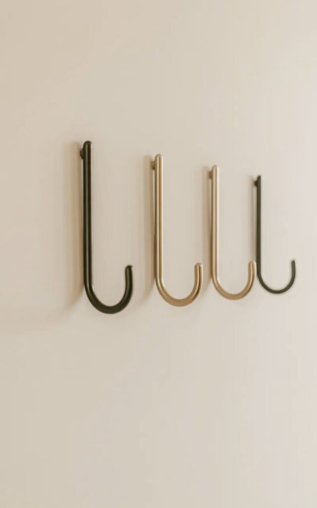
Slim coat rack/hooks:
Pros:
- Vertical storage solution
- Essential functionality
- Minimal footprint
Cons:
- Not technically furniture
- Can look cluttered if overused
The inspo chose the small stool approach—perfect because it adds function and beauty without blocking anything.
What NOT to Include
Skip these in small entryways:
- Standard console tables (too deep)
- Benches (unless wall-mounted)
- Large coat racks
- Floor mirrors (take up valuable wall space)
- Multiple furniture pieces
Lighting: The Small Space Game-Changer
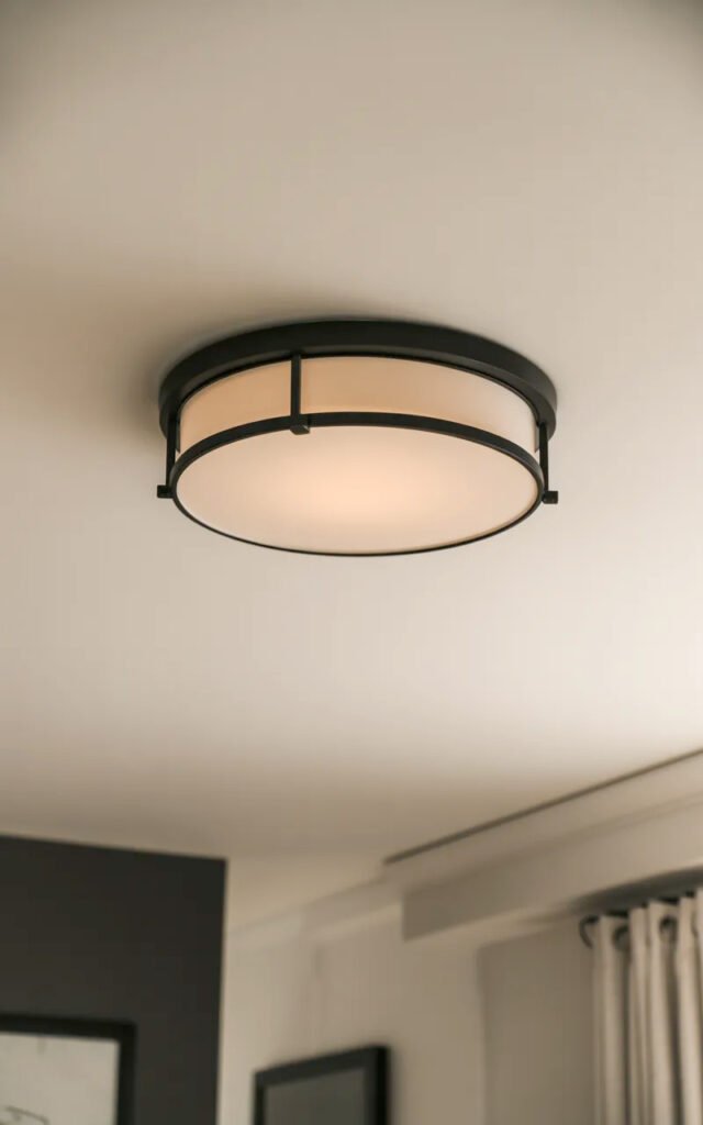
That picture light above the gallery wall in the inspiration image? Strategic genius. Hall aesthetic is 50% lighting.
Why Lighting Matters More in Small Spaces
No natural light: Most small entryways have no windows.
Dark = feels smaller: Poorly lit spaces feel cramped and unwelcoming.
Sets the mood immediately: First thing guests experience.
Makes everything look better: Good lighting elevates even simple decor.
Provides safety: Need to see where you’re walking.
Types of Lighting for Small Entryways
Picture lights (like the inspo):
What: Small light mounted above art to illuminate it
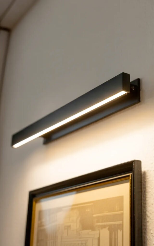
Why they work:
- Create focal point on gallery wall
- Add ambient glow
- Gallery-like sophistication
- Don’t take up space
Options:
- Hardwired (professional installation)
- Plug-in with cord cover
- Battery-operated LED (easiest)
Placement:
- Centered above art
- 4-6 inches from wall
- Angled down at 30 degrees
Overhead lighting:
Flush-mount fixture:
- Essential for general light
- Choose something interesting (not boring builder-grade)
- Warm white bulbs (2700-3000K)
- Dimmer if possible
Pendant light:
- If ceiling height allows
- Adds personality
- Can be dramatic in small space
- Keep it proportional (not too large)
Wall sconces:
When they work:
- If you have a bit more wall space
- On either side of door
- Or flanking mirror
When to skip:
- Very narrow entryways (stick out too much)
- Limited wall space
Smart lighting:
Motion-sensor option:
- Hands full? Light turns on automatically
- Energy efficient
- Modern and convenient
I installed a battery-operated LED picture light above my gallery wall ($35 on Amazon). Changed the entire feel of my entryway from dark and forgotten to highlighted and intentional. Best $35 I ever spent.
Color Temperature Matters
Warm white (2700-3000K):
- Welcoming and cozy
- Makes spaces feel more inviting
- Essential for residential
Never cool white:
- Feels institutional
- Harsh and unwelcoming
- Makes skin look terrible
Brightness:
- 100-150 lumens per square foot
- Small entryways need BRIGHT light
- Don’t underwhelm—darkness makes it feel smaller
Color and Paint Strategy
The warm, creamy walls in the inspiration image aren’t accidental. Color choice is critical in simplistic home decor for small spaces.
Best Paint Colors for Small Entryways
Warm whites and creams:
- Reflect maximum light
- Feel open and airy
- Work with any decor
- The inspo appears to use warm cream/beige
Specific recommendations:
- Benjamin Moore: White Dove, Decorator’s White
- Sherwin Williams: Alabaster, Pure White
- Or slightly warmer: soft beige or cream
Soft warm neutrals:
- Very light beige, greige, or warm gray
- Still feels open
- Adds subtle warmth
- Benjamin Moore: Edgecomb Gray, Manchester Tan
What to Avoid
Dark colors:
- Make small spaces feel smaller
- Absorb light
- Can work but risky in tiny entryways
Cool colors:
- Gray with blue undertones feels cold
- Stark white feels harsh
- Want warm, welcoming tones
Bold colors:
- Can overwhelm small spaces
- Best to keep neutral and add color through art/accessories
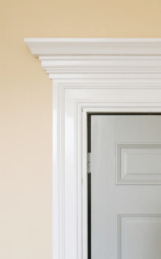
Trim and Ceiling
Trim color:
- Same as walls (monochromatic = larger)
- Or crisp white for definition
- The inspo uses white trim
Ceiling:
- Same as walls to eliminate boundaries
- Or white (safe choice)
- Never darker than walls
I painted my tiny entryway in Benjamin Moore’s “Simply White” in satin finish (walls, trim, and ceiling all the same). Made my cramped space feel dramatically larger and brighter. One gallon was plenty: $45.
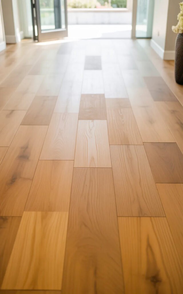
Flooring and Rugs
The simple runner rug in the inspiration image adds warmth without overwhelming. Let’s talk flooring strategy.
Small Entryway Rug Guidelines
Size:
- Small runner (2×3 or 2.5×4 feet)
- Or skip if VERY tight
- Should leave floor visible around edges
- The inspo has appropriate scale
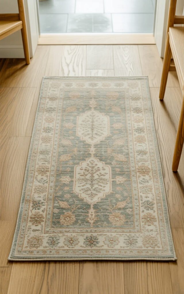
Color and pattern:
- Light to medium tones
- Subtle pattern (like inspo) or solid
- Nothing too bold or dark
- Warm neutrals work best
Material:
- Flatweave for low profile
- Easy to clean (entryways get dirty)
- Non-slip backing essential
Placement:
- Centered in walkway
- Not blocking door swing
- Parallel to walls
When to skip the rug:
- If space is less than 3 feet wide
- If it blocks door operation
- If it makes walkway feel cramped
Flooring Choices
Light wood (ideal):
- Like the inspo appears to have
- Makes space feel larger
- Warm and welcoming
- Wide planks better than narrow
Light tile:
- Cream, beige, light gray
- Large format (fewer grout lines)
- Durable and easy to clean
Luxury vinyl plank:
- Affordable wood-look option
- Waterproof and durable
- Wide planks
The Plant Element
That simple plant on the stool in the inspiration image adds life without clutter. Here’s how to incorporate greenery in tiny spaces.
Why One Plant Works
Brings life: Literally and figuratively.
Adds natural element: Softens the space.
Doesn’t require much space: One plant on small table = perfect scale.
Easy maintenance: Just one to care for.
Adds height: Vertical interest.
Best Plants for Small Entryways
Low-light tolerant:
- Snake plant
- Pothos
- ZZ plant
- Peace lily
Compact size:
- Small to medium (12-24 inches)
- Not so large it overwhelms
Low maintenance:
- Can tolerate neglect
- Don’t need constant attention
In the inspo:
- Looks like a ficus or similar
- Substantial but not huge
- In simple white planter
Planter Selection
Keep it simple:
- White or neutral ceramic (like inspo)
- No bold patterns or colors
- Proportional to plant
- Clean, modern
Size:
- 6-10 inches diameter
- Not too large for your table/stand
I have a small snake plant in a white ceramic pot ($25 total from a local nursery) on my entryway stool. Adds life to the space, needs water maybe once every 2 weeks, and has survived my neglect beautifully.
Minimalist Styling Principles
The inspiration image is a masterclass in simplistic home decor. Let’s decode the minimalist approach.
The “Three Item Maximum” Rule
In tiny entryways, limit yourself to THREE decorative elements:
The inspo has:
- Gallery wall (counts as one element)
- Plant on stand
- Light fixture
That’s it. That’s all you need.
What to Include
Choose from:
- Gallery wall or single piece of art
- One small furniture piece
- One plant or decorative object
- One special light fixture
- Small catchall for keys
Pick your top 3 and stop. More is clutter in small spaces.
What to Exclude
Skip these in tiny entryways:
- Multiple decorative objects
- Unnecessary furniture
- Too many plants
- Coat hooks (if not needed)
- Mirrors (if no space)
- Baskets and bins everywhere
- Signs with sayings
- Seasonal decor overload
Styling Your Small Table/Shelf
If you have a surface:
Option 1: Just a plant (like inspo)
- Simple, clean, perfect
Option 2: Plant + small catchall
- For keys, mail
- Keep it minimal
Option 3: Decorative object + practical item
- Small sculpture + key dish
- Vase + catchall
Never:
- Piles of stuff
- Multiple items fighting for attention
- Things you don’t use
Entryway Functionality in Minimal Space
The space still needs to function. Here’s how to maintain home entry way ideas practicality.
The Essentials
Where to put keys:
- Wall-mounted key hooks by door
- Small catchall on your one piece of furniture
- Adhesive hook inside door
Where to put shoes:
- Slim shoe rack near door
- Under bench if you have one
- Coat closet if available
- NOT scattered on floor
Where to hang coats:
- Wall hooks (3-4 maximum)
- Over-door hooks
- Coat closet
- NOT on doorknobs or furniture
Where to put mail:
- Wall-mounted mail sorter
- Small basket on shelf
- Deal with it immediately (best option)
Keeping It Organized
Daily habits:
- Put keys in designated spot
- Hang coats on hooks
- Shoes in proper place
- Deal with mail (don’t let it pile)
Weekly maintenance:
- Quick tidy (2 minutes)
- Remove anything that doesn’t belong
- Wipe down surfaces
- Fluff rug
Monthly deep clean:
- Dust art and frames
- Clean plant leaves
- Vacuum or mop floor
- Touch up paint if scuffed
Budget Breakdown: Small Entryway Makeover ($250)
Paint (walls, trim, ceiling): $50
- One gallon quality paint
Three frames + prints: $75
- IKEA or similar frames
- Printed photos
Small plant stand/stool: $40
- Thrift or new
Plant and planter: $25
- Small plant in simple pot
Picture light: $35
- Battery-operated LED
Small rug: $40
- 2×3 or 2.5×4 feet
Total: ~$265
Alternatively, even cheaper:
- Skip new furniture (use what you have)
- DIY frames
- Free plant cuttings from friends
- Skip rug if tight
Minimum investment: ~$100 for just paint, frames, and a plant
Common Small Entryway Mistakes
Don’t make these errors:
Mistake #1: Too Much Furniture
One console table blocking the entire walkway. Nope. One small piece maximum.
Mistake #2: Horizontal Gallery Wall
Spreading art across limited wall width makes it feel cluttered. Go vertical instead.
Mistake #3: Dark Paint
Dark walls make tiny spaces feel like caves. Keep it light.
Mistake #4: No Lighting
One dim overhead bulb doesn’t cut it. Add layers and brightness.
Mistake #5: Over-Decorating
Trying to fit too much into too little space. Embrace minimalism.
Mistake #6: Large Rug
Oversized rug makes tiny space feel more cramped. Keep it proportional or skip it.
Mistake #7: Ignoring Function
Making it pretty but forgetting you need places for keys, coats, shoes.
Small Entryway Storage Solutions
You need storage but no space. Here’s how:
Wall-Mounted Options
Hooks:
- 3-4 simple hooks max
- Black or brass
- Space 6-8 inches apart
- Mount at 60 inches high
Floating shelf:
- 6-8 inches deep
- 24-36 inches wide
- For keys, mail, small items
Mail sorter:
- Wall-mounted
- Keeps paper off surfaces
Furniture with Hidden Storage
Storage stool:
- Lift-top for shoes, accessories
- Serves as table AND storage
Slim bench:
- If you have width
- Storage underneath
- Wall-mounted to save floor space
Utilizing Door Space
Over-door hooks:
- For coats, bags
- No installation needed
- Renter-friendly
Inside-door hooks:
- Adhesive hooks
- For keys, small bags
- Hidden from view
Adapting for Different Entryway Shapes
If your entryway is a narrow corridor:
- Vertical gallery wall on one side
- Hooks on opposite side
- Skip furniture entirely
If your entryway is a small landing:
- Gallery wall on main wall
- Small table in corner
- Hooks by door
If your entryway opens directly to living space:
- Define with rug
- Gallery wall creates visual boundary
- Keep extra minimal
Quick Wins for Immediate Impact
If you can only do THREE things:
- Gallery wall (3 frames, $75)
- Good lighting (picture light, $35)
- Fresh paint (light neutral, $50)
Total: $160, transforms the entire space.
Final Thoughts: Small But Mighty
A tiny entryway doesn’t have to be a design challenge—it can be an opportunity to practice the art of intentional minimalism. The inspiration image proves that you don’t need much: a vertical gallery wall, one small piece of furniture with a plant, good lighting, and fresh neutral paint. That’s the formula.
Less truly is more in small spaces. Every item you add should be intentional, beautiful, and ideally functional. When you embrace the limitations and work WITH the tiny proportions rather than fighting them, magic happens.
Start with what will make the biggest impact: paint your walls a warm, light neutral. Then add your vertical gallery wall—three matching frames with meaningful photos. Install a picture light above. Done. Those three things alone will transform your cramped entryway into something special.
My tiny entryway went from embarrassing to one of my favorite spots in my apartment. Total investment: less than $200. Total time: one weekend. The impact on how I feel coming home every day? Priceless.
Your small entryway deserves attention and care. Give it the simple, intentional design it needs, and it’ll reward you with a beautiful first impression every single time you walk through the door. 🙂