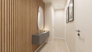
Ever walked into someone’s house and been stopped in your tracks by their entryway? Not because it’s huge or fancy, but because somehow they made a tiny space feel absolutely intentional and impressive?
That’s the power of smart small spaces entryway design. And if you want maximum impact with minimum space, black and white is your secret weapon. It’s bold, it’s classic, it never goes out of style, and it makes even the tiniest entrance look like you hired a designer.
Let me show you how to create that “wow” moment in whatever small space you’re working with.
Why Black And White Hallway Decor Works
Black and white hallway decor isn’t just a trend—it’s a timeless approach that actually solves a lot of design problems small entryways typically have.
Why this color combo is genius for small spaces:
- Creates clear contrast that defines the space
- Makes the area feel intentional instead of neglected
- Works with literally any other color if you want accents
- Never goes out of style (unlike that trendy color you loved in 2018)
- Makes small spaces feel graphic and interesting instead of cramped
I was terrified to go dark in my tiny 4×6 foot entryway, thinking it would feel like a closet. Turns out, the bold contrast actually made it feel more spacious and way more interesting than boring beige ever did.
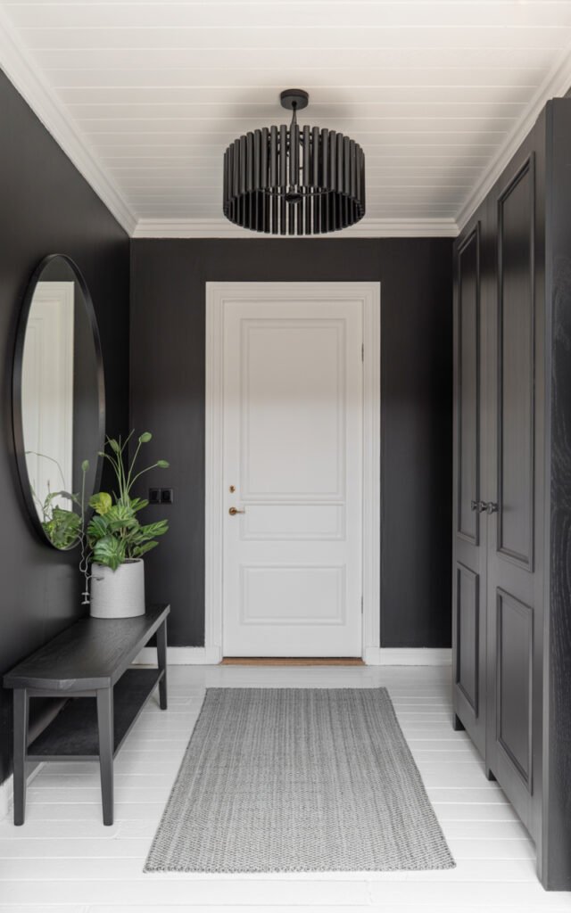
The Drama Of Black Walls
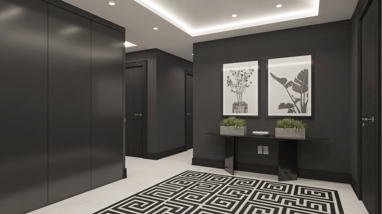
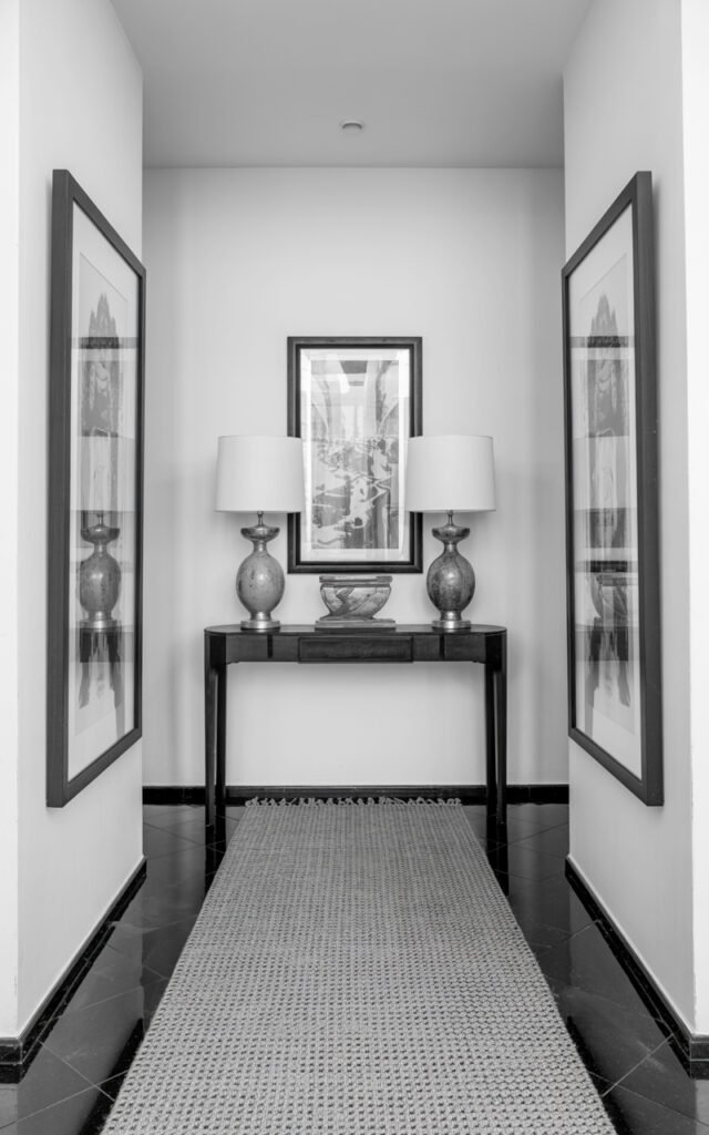
Look at that image—those black accent walls are doing ALL the work. They create depth, drama, and make everything else (the art, the plants, the geometric rug) pop like crazy.
Black wall benefits in small entryways:
- Creates a dramatic backdrop that makes decor stand out
- Hides imperfections in older walls
- Makes the space feel cocooned and intentional
- Provides contrast that makes the space feel defined
- Works in both modern and traditional styles
I painted one wall of my entryway matte black (Benjamin Moore Onyx), and people’s reactions went from “oh, you have an entryway?” to “WOW, that’s stunning.” Same space, just paint. Cost me one gallon ($45) and an afternoon.
Choosing The Right Black
Not all blacks are created equal. There’s warm black, cool black, matte, glossy—it matters.
Best blacks for small entryways:
- Matte finish (hides imperfections, looks sophisticated)
- Warm-toned blacks (less stark, more welcoming)
- Deep charcoal (if true black feels too intense)
Avoid:
- Glossy black (shows every imperfection and fingerprint)
- Cool-toned blacks (can feel harsh in small spaces)
I went with matte because it photographs beautifully and doesn’t show every single smudge from touching the wall while taking off shoes.
Modern Black And White Hallway: The Ceiling Detail
That recessed lighting with the cove ceiling in the image? That’s what takes this from nice to “is this a luxury hotel?”
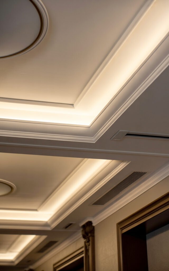
Ceiling treatments in small entryways:
- Recessed lighting creates clean, modern lines
- Cove ceilings with LED strips add indirect glow
- White ceilings keep the space from feeling closed in
- Multiple light sources eliminate dark corners
I couldn’t do a full ceiling renovation, but I added LED strip lighting around my ceiling perimeter for $30 on Amazon. The indirect glow makes my 8-foot ceiling feel higher and adds that hotel-lobby sophistication.
Lighting That Makes Or Breaks The Space
In a black foyer, lighting isn’t optional—it’s absolutely essential. Dark walls absorb light, so you need more sources than you think.
Lighting formula for black and white entryways:
- Ceiling lights (recessed, flush mount, or pendant)
- Wall sconces if you have wall space
- LED strips for ambient glow
- Table lamp on console if there’s room
Don’t rely on one overhead light. You’ll create harsh shadows and the black walls will feel oppressive instead of dramatic.
That Geometric Rug: The Showstopper
Can we talk about that black and white geometric rug? Because it’s honestly the star of the show. In a monochrome space, a bold patterned rug adds visual interest without introducing color chaos.
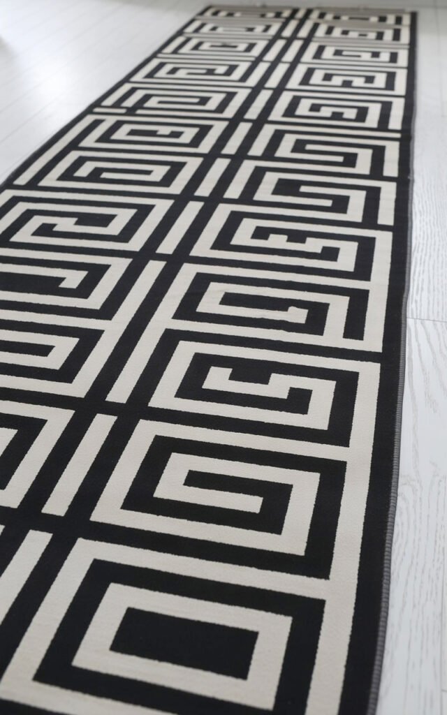
Why geometric rugs work in black and white entryways:
- Add pattern without adding color (keeps the scheme cohesive)
- Define the entryway as its own zone
- Create movement and visual interest
- Hide dirt way better than solid colors
- Make the space feel designed and intentional
I found a geometric runner on Wayfair (similar vibe to the image) for $130. It’s been in my high-traffic entryway for two years and still looks great because the busy pattern disguises wear and dirt.
Choosing The Right Rug Pattern
Not all geometric patterns work in small spaces. Some can feel overwhelming.
Patterns that work:
- Medium-scale geometrics (not too tiny, not too large)
- Maze or Greek key patterns (like in the image)
- Chevron or zigzag (creates movement)
- Modern tribal patterns
Patterns to avoid:
- Tiny repeating patterns (look busy in small spaces)
- Massive bold patterns (overwhelm the area)
- Anything too literal (keep it abstract)
Modern Monochrome Hallway: Art As Architecture
Those framed botanical prints in the image aren’t just decoration—they’re architectural elements. In a modern monochrome hallway, art serves a bigger purpose.
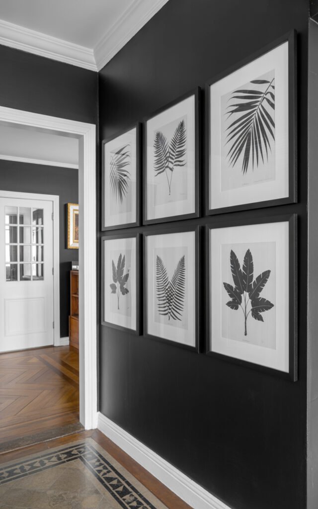
Art strategies for black and white entryways:
- Large-scale pieces (go bigger than you think)
- Black and white photography or prints
- Botanical silhouettes (like in the image)
- Abstract geometric art
- Gallery wall of coordinated frames
I’ve got two large-scale black and white botanical prints (printed at Costco for $15 each, framed in simple black frames from IKEA for $20 each). Total cost: $70 for what looks like a gallery installation.
Scale Matters
Small space doesn’t mean small art. Actually, the opposite—larger art makes small spaces feel more intentional.
The prints in the image are substantial, probably 24×36 or larger. They command attention and make the narrow hallway feel like a gallery instead of just a pass-through.
Small Hall Design: The Console Solution
That sleek black console in the image provides function without eating up precious space. In small hall design, every piece of furniture needs to earn its place.
Console table requirements for tiny entryways:
- Slim profile (10-12 inches deep maximum)
- Storage if possible (drawers or lower shelf)
- Height around 30-36 inches (standard console height)
- Visually light (not heavy or bulky-looking)
- Matches your color scheme
I’ve got a narrow black console (10 inches deep from IKEA, $80) that holds keys, mail, and looks intentional. It provides function without making my small space feel cluttered.
What To Put On Your Console
In a black and white scheme, console styling is crucial—it either completes the look or ruins it.
Console styling for monochrome entryways:
- One or two statement plants (like in the image)
- A tray for keys/sunglasses
- One sculptural object (ceramic vase, abstract piece)
- Maybe one framed photo in black frame
In the image, there are two identical vases with plants—simple, symmetrical, and sophisticated. That’s the formula.
Black Hallway Ideas: Making Darkness Work
Black hallway ideas often scare people because they worry it’ll feel like a cave. But done right, black makes small spaces feel like intentional design moments.
Keys to successful black hallways:
- Abundant lighting (more than you think you need)
- White or light flooring for contrast
- Reflective surfaces (mirrors, glass, metal accents)
- Regular cleaning (black shows dust more)
- Confidence (commit to the drama)
My black accent wall gets compliments constantly, but I also have white floors, good lighting, and a big mirror reflecting light. It’s the combination that works, not just the black alone.
Passage Decor Hallways: Creating Flow
Passage decor hallways need to function as transitions without feeling like forgotten spaces. In small homes, hallways connect rooms—they’re not separate entities.
Creating flow in small hallways:
- Continue flooring from adjacent rooms
- Use colors that echo nearby spaces
- Keep the path clear and unobstructed
- Add elements that guide the eye forward
- Create visual interest that draws you through
My entryway flows into my living room, so I made sure the black and white scheme connects. The white from the hallway is picked up in my living room furniture, and the black appears in accent pieces. Feels cohesive, not disjointed.
Hallway Black And White: The Contrast Formula
Hallway black and white design is all about balance. Too much black feels oppressive, too much white feels sterile.
The contrast ratio that works:
- 60% white (walls, ceiling, or floor)
- 30% black (accent wall, furniture, or major elements)
- 10% gray or metallic accents (for transition and interest)
This isn’t a hard rule, but it’s a good starting point. The image follows this roughly—white ceiling and floor, black accent walls and furniture, with the rug providing textural variation.
Adding Warmth To Monochrome
Black and white can feel cold if you’re not careful. Here’s how to add warmth:
Warming up monochrome spaces:
- Warm white paint (not stark cool white)
- Wood tones (even just picture frames)
- Plants and greenery
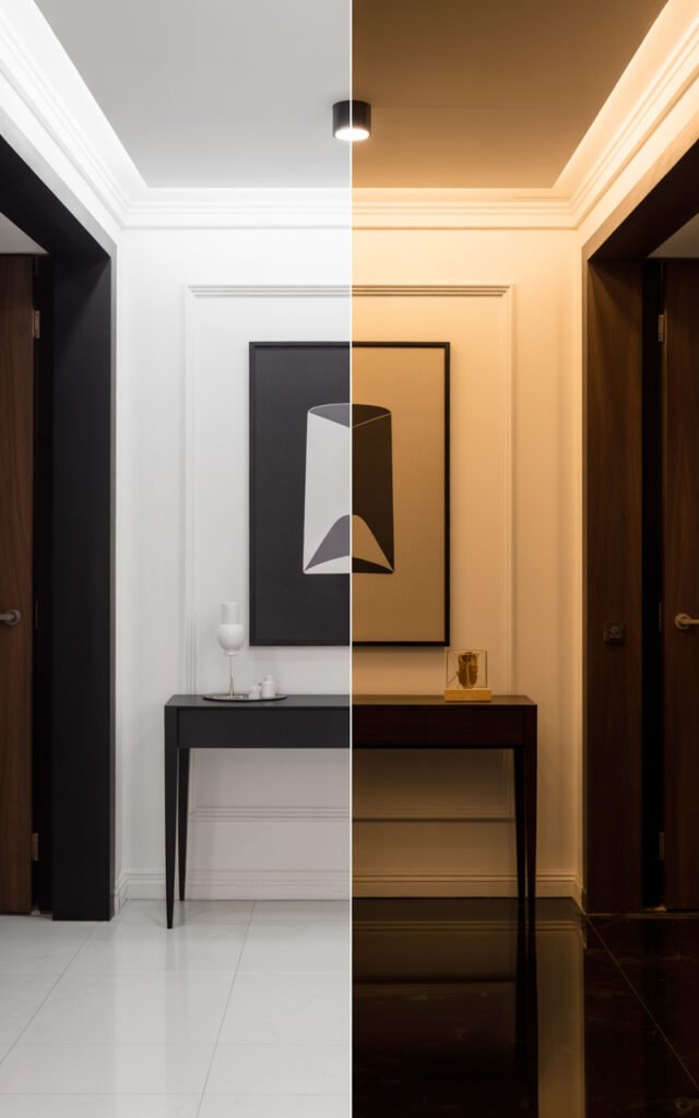
- Warm lighting (2700-3000K bulbs)
- Textures (woven baskets, textured art)
I added a small wooden tray on my console and use warm white bulbs. The contrast scheme stays dramatic, but it doesn’t feel cold or unwelcoming.
Black White Hallway Decor: Styling Principles
Black white hallway decor follows different rules than color-filled spaces. You’re working with contrast and texture instead of color variety.
Styling principles for monochrome:
- Use odd numbers (3 or 5 items, not 2 or 4)
- Vary heights (create visual rhythm)
- Mix textures (matte, glossy, rough, smooth)
- Use negative space (everything doesn’t need to be filled)
- Keep it simple (the drama comes from contrast, not quantity)
The image is masterfully styled—two matched plants, two large art pieces, the geometric rug, and a console. Maybe 5-6 elements total, but the impact is huge because they’re well-chosen and properly scaled.
Black Foyer Lighting Strategies
A black foyer needs smart lighting or it becomes a problem. Let’s get specific.
Lighting placement for black entryways:
- Overhead: recessed or flush mount centered in space
- Wall: sconces flanking art or at regular intervals
- Accent: LED strips in ceiling coves or under consoles
- Task: table lamp on console if space allows
The image has recessed ceiling spots, that gorgeous cove lighting, and probably additional task lighting we can’t see. Multiple layers creating dimension.
I’ve got one overhead light, LED strips around my ceiling edge, and a small lamp on my console. Three light sources in a 4×6 space sounds like overkill, but it’s what makes the black walls work instead of feeling dark.
Small Space Storage Solutions
In small entryways, storage is always a challenge. You need function without clutter.
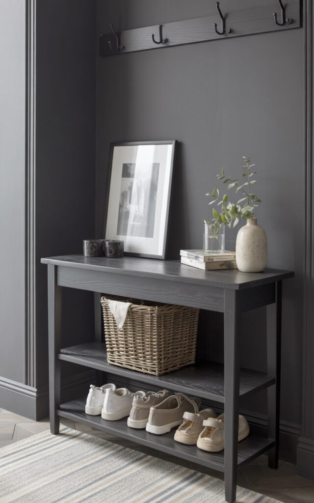
Hidden storage in small black and white entryways:
- Console with drawers or lower shelf
- Wall hooks (in black to blend with decor)
- Shallow shoe cabinet (12 inches deep maximum)
- Baskets on console lower shelf
- Behind-the-door storage if there’s a closet
I installed three black hooks on my black wall (invisible but functional) and have a basket on my console’s lower shelf for shoes. Everything has a home so nothing clutters the visual impact.
The Power Of Symmetry
Notice the image is almost perfectly symmetrical—two art pieces, two plants, centered console and rug. In small spaces, symmetry creates calm and order.
When to use symmetry:
- In very small spaces (creates order)
- In narrow hallways (draws eye forward)
- When you want classic, timeless style
- With limited elements (easier to balance)
When to break symmetry:
- If your space is slightly larger
- For more casual, relaxed feel
- When you have more wall space
- To create visual interest in longer hallways
My space is tiny, so I went symmetrical—one large mirror centered, balanced styling on my console. Keeps it feeling calm instead of chaotic.
Budget Breakdown: Black And White Transformation
Because I’m not going to pretend this costs nothing, but it’s way more affordable than you’d think.
Minimal budget ($200-400):
- Black paint for accent wall
- Geometric runner rug
- DIY or budget prints in black frames
- LED strip lighting
- Small console table
- Basic decor items
Mid-range budget ($400-800):
- Quality paint and primer
- Better quality geometric rug
- Larger-scale art or photography
- Multiple light sources
- Nicer console with storage
- Plants and quality styling pieces
Higher-end budget ($800-1,500):
- Professional painting
- Designer geometric rug
- Custom or original art
- Recessed lighting installation
- High-end console
- Professional styling
I’m in the mid-range at about $650 total. My black and white entryway gets more compliments than any other space in my home, and it cost less than a new couch.
Common Mistakes To Avoid
Let me save you from things I learned the hard way:
Don’t skimp on lighting. I cannot stress this enough. Black walls need more light than you think. Budget for good lighting first.
Don’t use harsh cool white bulbs. They make black and white feel like an office building. Use warm white (2700-3000K) to keep it feeling welcoming.
Don’t clutter the space. The impact comes from the bold contrast, not from filling every surface with stuff.
Don’t forget about the ceiling. In the image, the ceiling treatment is a major design element. Don’t leave yours boring builder-white if you’re going bold elsewhere.
Maintenance Reality Check
Black and white shows dirt differently than other colors. Here’s the reality:
What shows:
- Dust on black surfaces (visible)
- Scuffs on white walls (noticeable)
- Footprints on white floors
Weekly maintenance:
- Dust black surfaces
- Wipe console and decor
- Vacuum or clean floor/rug
- Touch up any marks on white walls
This is maybe 10 minutes weekly. The payoff is a space that looks intentionally designed every single day.
Rental-Friendly Alternatives
Renting doesn’t mean you can’t do dramatic black and white.
No-damage options:
- Removable black wallpaper instead of paint
- Peel-and-stick geometric floor tiles
- Plug-in LED strip lighting
- Furniture and rugs (all removable)
- Lean-against-wall art (no holes needed)
I rented for years and still did black accent walls with removable wallpaper. Got my security deposit back every time because I didn’t damage anything permanent.
Making It Personal
Even in a strict black and white scheme, you can add personality without breaking the aesthetic.
Personal touches in monochrome:
- Black and white family photos in frames
- Travel souvenirs in neutral colors
- Books with black/white covers
- Meaningful art that happens to be monochrome
- Plants (always appropriate and add life)
My black and white entryway has one black-framed photo from a trip to New York (very personal, fits the scheme) and a plant my best friend gave me. The scheme is cohesive, but it still feels like mine.
Beyond Basic: Taking It Further
Once you’ve got the basics down, you can add sophisticated touches.
Advanced black and white techniques:
- Textured black walls (grasscloth wallpaper)
- Glossy black doors with matte black walls
- Black ceiling (only if you’re brave and have good lighting)
- Mixed patterns (geometric rug + striped art)
- Metallic accents (brass, gold, chrome)
The image has multiple textures—matte black walls, glossy console, the patterned rug, the plants. It’s monochrome but not flat because of those varied textures.
The Final Impression
Creating a stunning small spaces entryway with black and white hallway decor comes down to bold contrast, abundant lighting, proper scale, geometric pattern, and restrained styling.
That’s it. Five principles that transform a tiny, forgettable space into something people remember and compliment.
Whether you’ve got 15 square feet or 50, whether you’re renting or own, whether you’ve got $200 or $2,000—the approach works. Black and white gives you maximum impact with minimum space and effort.
Your entryway is the first thing you see coming home and the last thing you see leaving. Shouldn’t it be something that makes you feel good instead of something you barely notice?
Now go look at your entryway with fresh eyes. I bet you’re already imagining it in black and white. 🙂